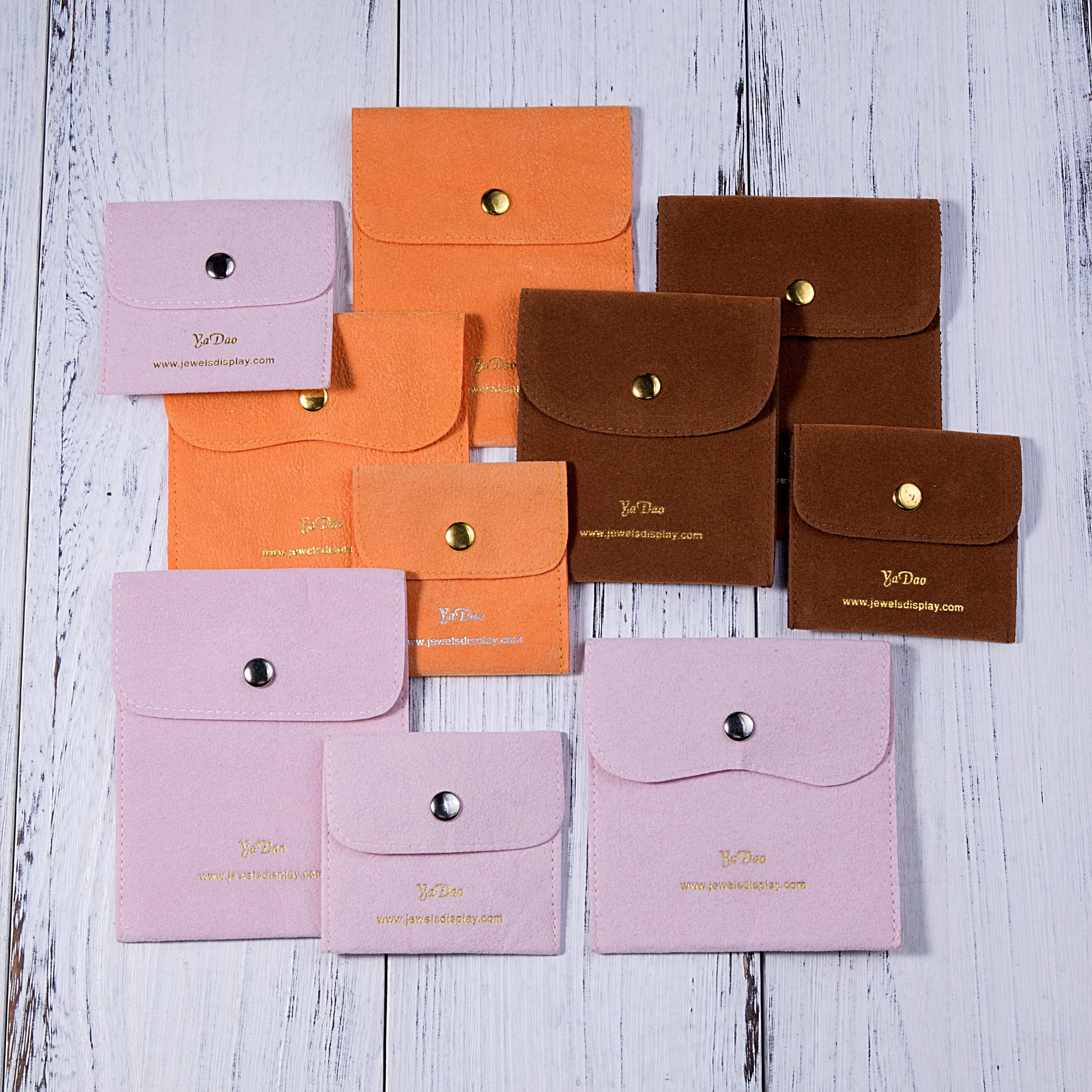
Innovative Use of Colors in Jewelry Packaging Logos
Jewelry packaging is an essential part of the sales process for any jewelry company. A well-designed and attractive jewelry packaging not only protects the jewelry but also adds value to the product.
In recent years, businesses have recognized the importance of a strong brand identity, and the use of logos in jewelry packaging has become increasingly prevalent. Colors play a significant role in creating any brand identity, and this applies to jewelry packaging logos as well. The use of colors is a powerful tool to create an emotional connection with customers and communicate the brand's personality and values. Here, we will discuss the innovative use of colors in jewelry packaging logos. 
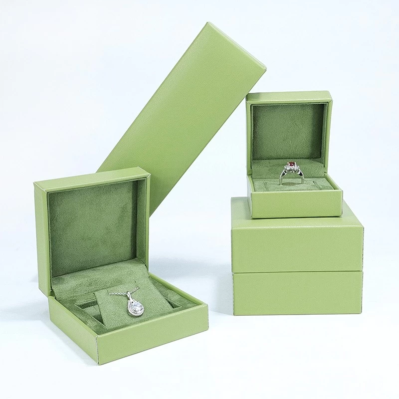
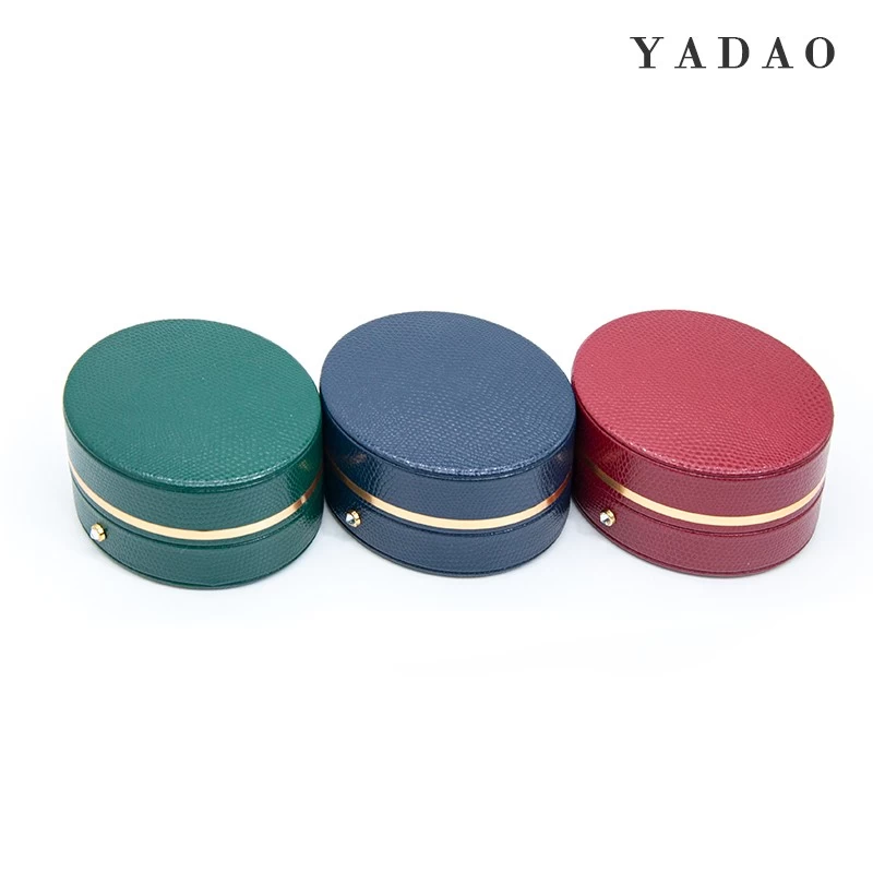
1) Green: Green is often associated with nature, health, and growth. It communicates freshness, sustainability, and a sense of balance. A jewelry packaging logo with green tones can be used to promote environmentally friendly and sustainable products.
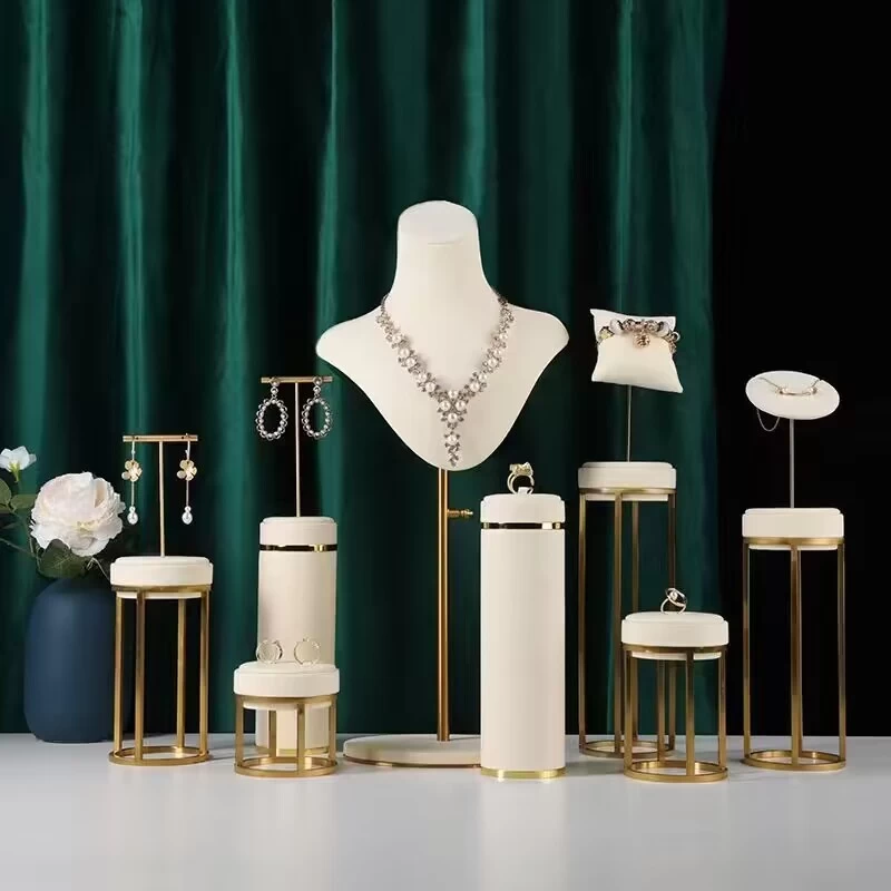
2) Gold: Gold is a classic color that is often associated with luxury, wealth, and sophistication. It is commonly used in high-end jewelry packaging logos and conveys a sense of elegance and exclusivity.
3) Red: Red is the color of passion, love, and excitement. It is used in jewelry packaging logos to evoke strong emotions and create a sense of urgency. A jewelry company that uses red in its logo may be communicating its strong commitment to love and romance.
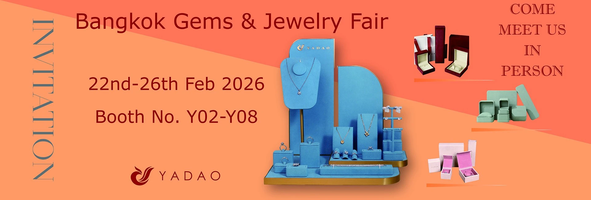
4) Blue: Blue is often associated with calmness, trust, and dependability. It is a popular choice for jewelry packaging logos as it creates a sense of trust and reliability. A jewelry company that uses blue in its logo may be communicating its dependable and trustworthy services.
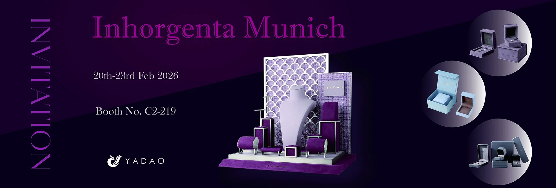
5) Purple: Purple symbolizes creativity, luxury, and royalty. It creates a sense of high value, quality, and sophistication. A jewelry company that uses purple in its logo may be communicating its commitment to create unique, high-quality, and luxurious products.
6) Black: Black is a classic color that is often associated with power, elegance, and mystery. It is popular in jewelry packaging logos as it creates a sense of sophistication and exclusivity. However, since it can also convey negative connotations like death and mourning, businesses need to use it carefully.
Overall, the innovative use of colors in jewelry packaging logos can play a significant role in creating a strong brand identity. By choosing the right colors, jewelry companies can communicate their values, personality, and overall brand message to its customers and stand out in a crowded marketplace.

